Brand Development & Messaging
Brand development is the work of giving a company something to stand for — and a consistent way of showing up, sounding, and acting that earns trust and sticks in people's minds. It's the sum of all associations people make with a company or person.
Branding is less about the logo and more about the decisions underneath it: what a company values, how it talks, and what it's willing to risk to be memorable for the right reasons and to the right audience.
It's a way to ensure enduring appeal to a target customer, focus a company's efforts toward activities that will most likely produce the desired outcomes.
—Rebrand—
Industry: Manufacturing
ArKco Sales is a family-owned manufacturers' rep firm for the electromechanical and electronics industry.
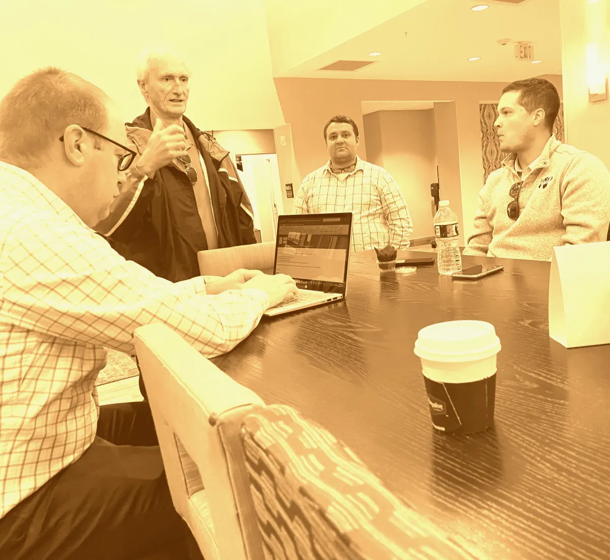
When I took on their brand development, the company had a logo and a line card, but no real identity — nothing the team could point to and say, "that's us." Here's how I built one.

Start With Values.
I led a workshop with the ArKco team to find the values they actually held in common. Not the platitudes companies default to, but the things that genuinely motivated them as individuals and shaped how they made decisions.
I pushed the group past the business-speak until we landed on four values: credibility, ingenuity, reliability, and initiative.
We mapped out what each one meant in practice — what behaviors and actions actually demonstrated them — and I codified the results into the company's pitch deck and its "About Us" web copy, so the values weren't just a poster on the wall but a working part of how ArKco described itself.

Distill Identity.
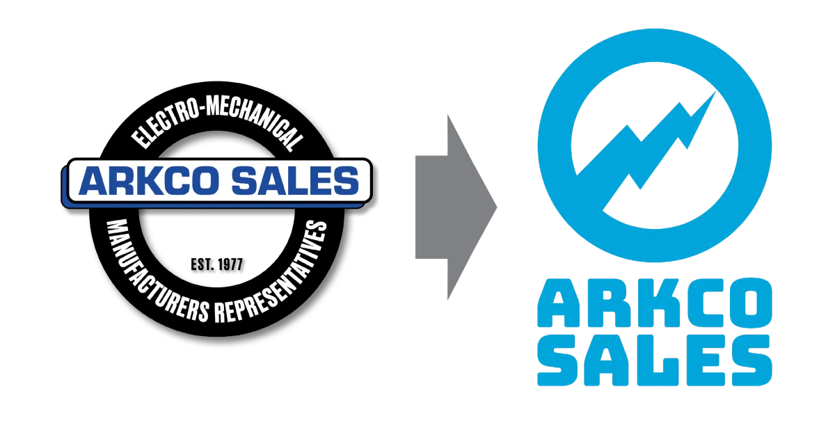
Next, I led a conversation about what was and wasn't working in the existing logo and identity suite.
The team agreed the old logo read as dated, and that its blue-black-gray palette was indistinguishable from every other manufacturer and rep group in the industry — unremarkable, undifferentiated, forgettable.
I also flagged a functional problem: the fine-print typeface wrapped around the logomark's ring didn't scale down cleanly. The team wanted a mark with more personality and energy that still communicated manufacturing and electromechanical/ electronics credibility. I designed the new identity and selected both typefaces myself.

Find the Voice.
I developed a brand voice for the website, social posts, and marketing materials.
Listening to how the team actually talked to customers — more relaxed and human than the tone they defaulted to in emails or brand discussions — I built a voice around a professionally restrained, geeky enthusiasm. It would be gregarious, genuinely curious, and confident in its own expertise without ever being arrogant.
"Fun" is not an adjective typically used to describe engineers and their sales reps. I made the case to ArKco leadership that it could be a real differentiator. And we could test the new voice in an area where people most expect fun: promotional merchandise.

Test With Customers.
Finally, I needed to test the new brand, and get live feedback from real customers.
I designed new swag to reinforce the visual brand connection — renaming each item with a cheeky nod to the electrical engineers who made up our core audience:
Pen LED light = Darkness Suppressor
Marine dry bag = Portable Hydroexclusion Chamber
Magnetic chip clip = Macrochip Clip
Pocket tissue pack = Sanitary Nasolacrimal Impedance Filters ("SNIFLs" for short)
Notepad = Analog Storage Drive